RuralVet Animal Centre
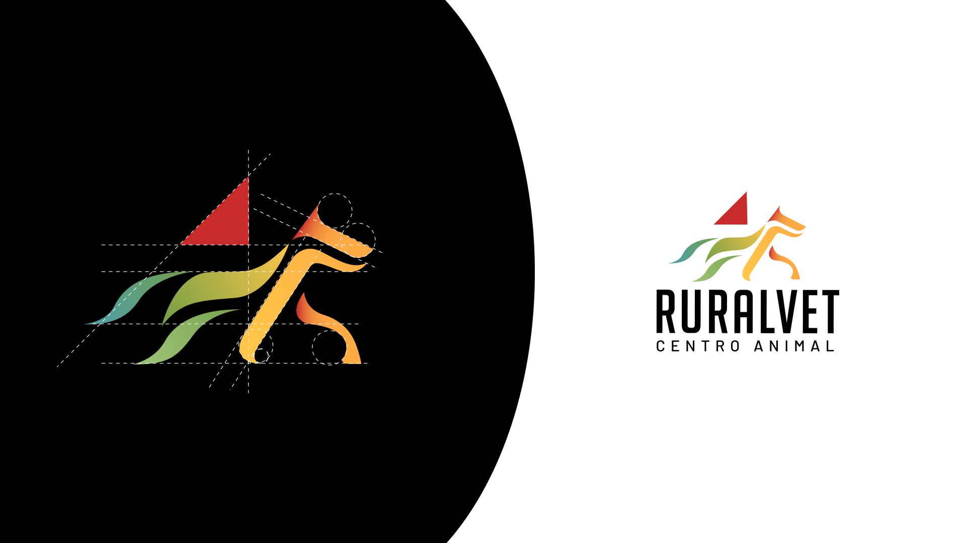
RuralVet Animal Centre is composed of a combination of two fundamental elements. The main element is a confused animal (a quadruped) that creates a sense of movement in the direction of reading in the West, from left to right. The second element represents part of a roof, which balances the weight of the logo and conveys a sense of stability.
The colours are a combination of natural elements in a rural setting… water – grass – earth – sun.
The tall, narrow typeface is used to make the name more compact and stable, giving the impression of growing upwards.
Cliente: Ruralvet Animal Centre
Servicio: Brand Identity Design
Año: 2022