MOIN!MOIN German Language School
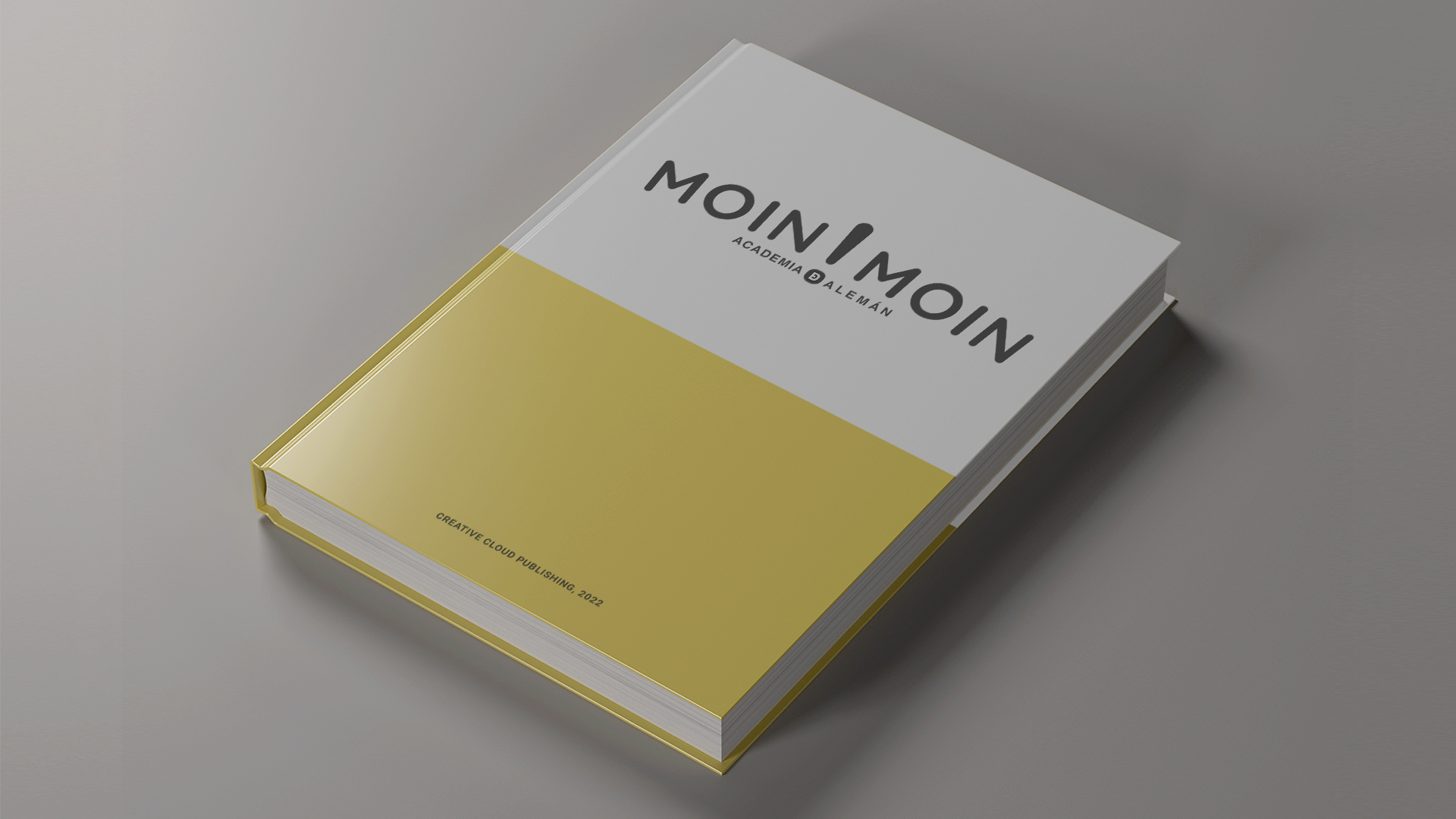
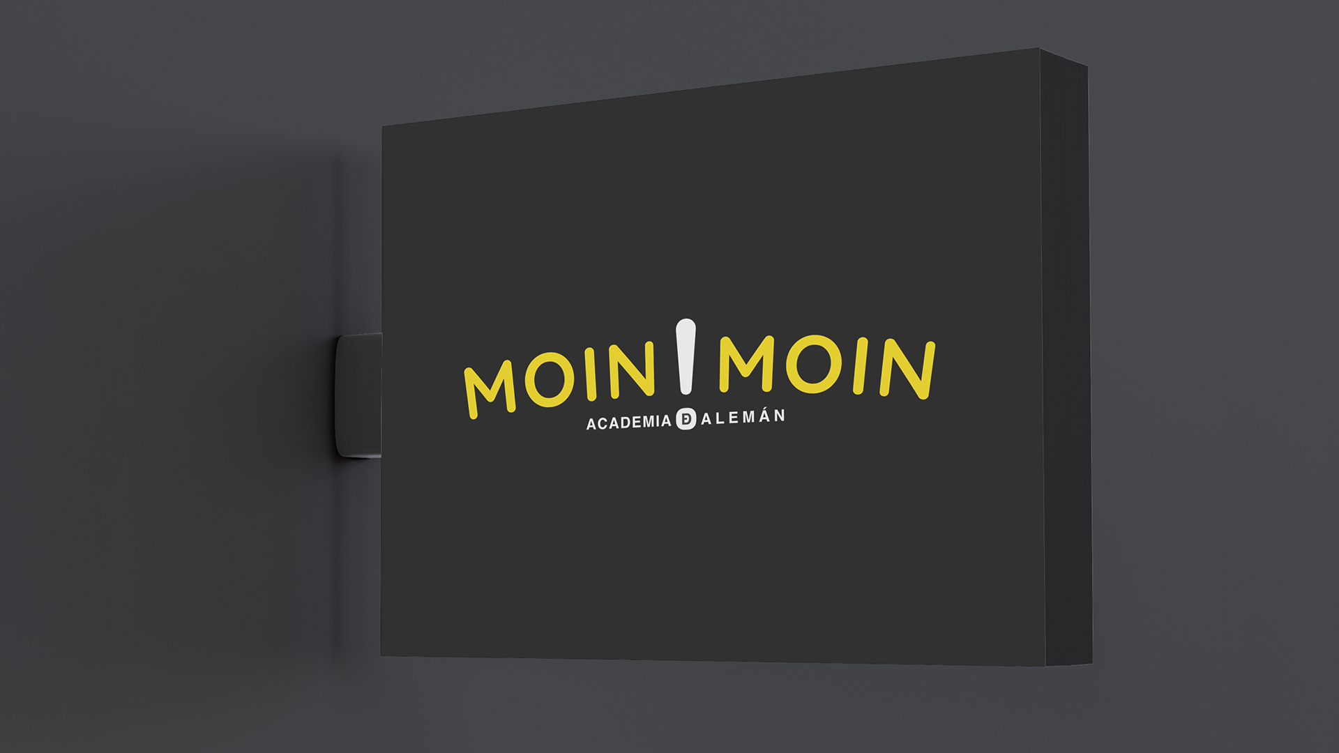
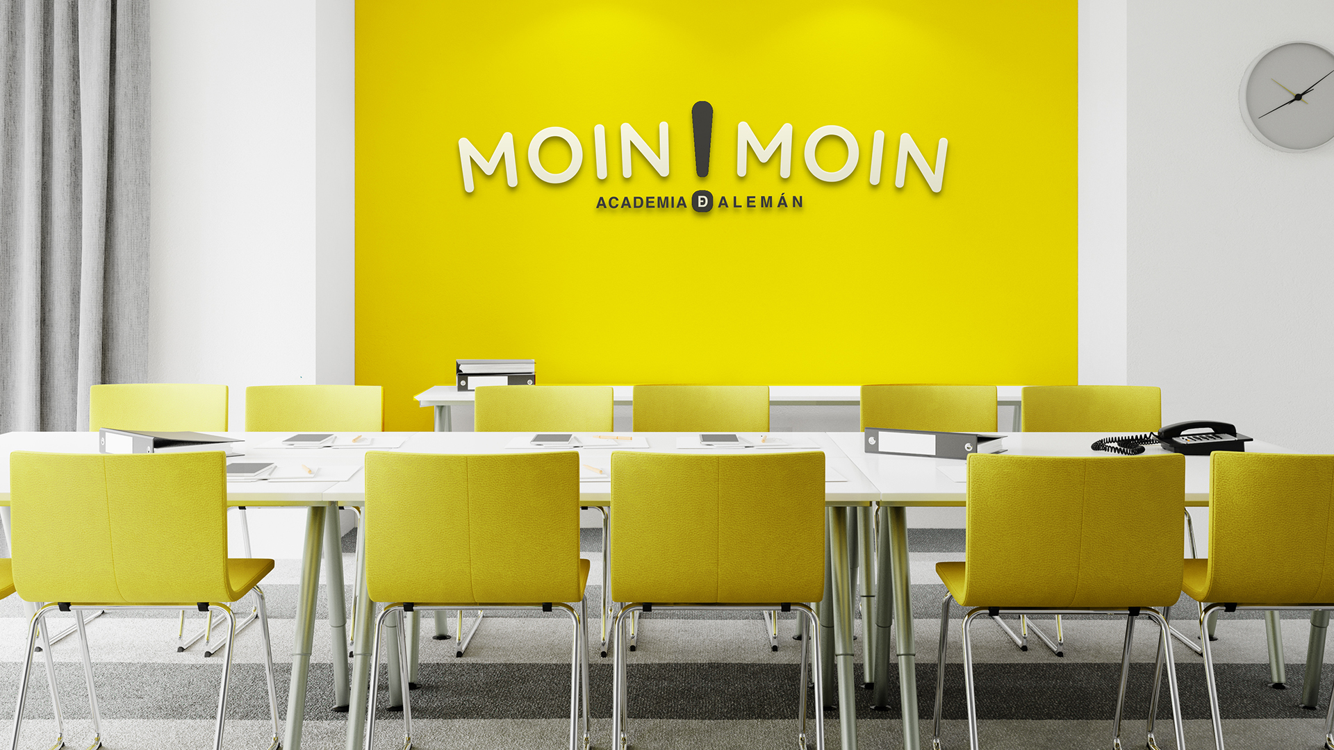
The Moin! Moin brand logo: when repeated in German, it means ‘good morning’, whilst the single word means ‘hello’.
The rounded edges, both in the logo and the brand’s typefaces, convey a sense of security and trust – ‘Safety’.
The repetition of the word creates a sense of balance, with the exclamation mark “!” acting as the central axis. The curvature of the words gives it a more “naive” and approachable feel.
The tagline or second line, “German academy”, is linked directly to the exclamation mark by the abbreviation “de”, with the “e” inside the “D”. This is a way of writing it in Old Spanish that is coming back into use, as well as representing the German language ‘DE’ (Deutschland).
The colours are very intense and high-contrast, which gives the brand a strong impact. They are a combination of black and yellow – colours often used in nature to signal danger or poison – but which have also been used in public services, such as the classic image of ‘Taxis’.
Cliente: Moin!Moin German Language School
Servicio: Brand Identity Design
Año: 2022