Identity: Dr Trinidad Institute Against Pain
The Institute Against Pain, headed by Dr Trinidad, commissioned us to design a new corporate identity for its Pain Unit. This unit covers all pain treatments and techniques for pain relief. For several years now, Dr Trinidad and his team have established themselves as leaders in this field of medicine, with Dr Trinidad being one of the most highly regarded specialists in the country.
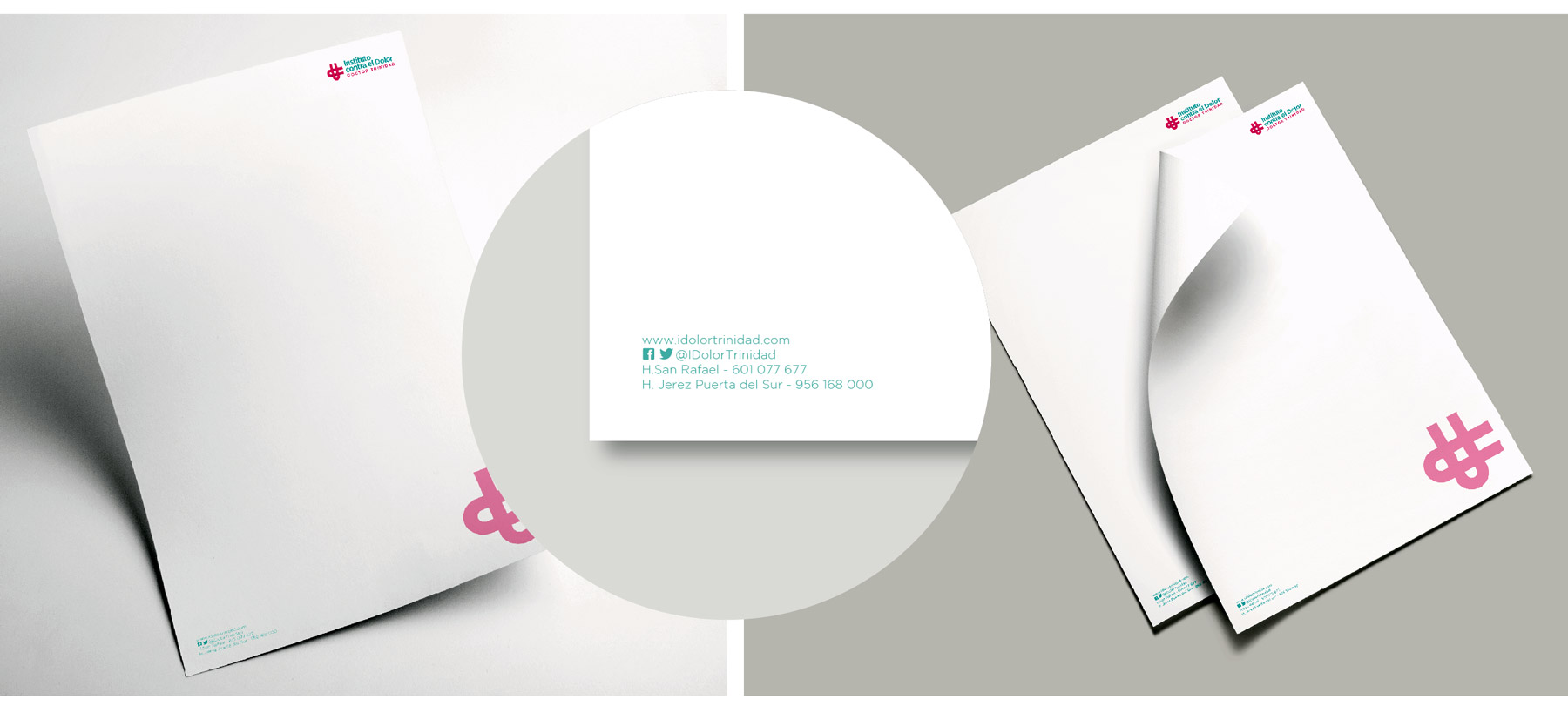
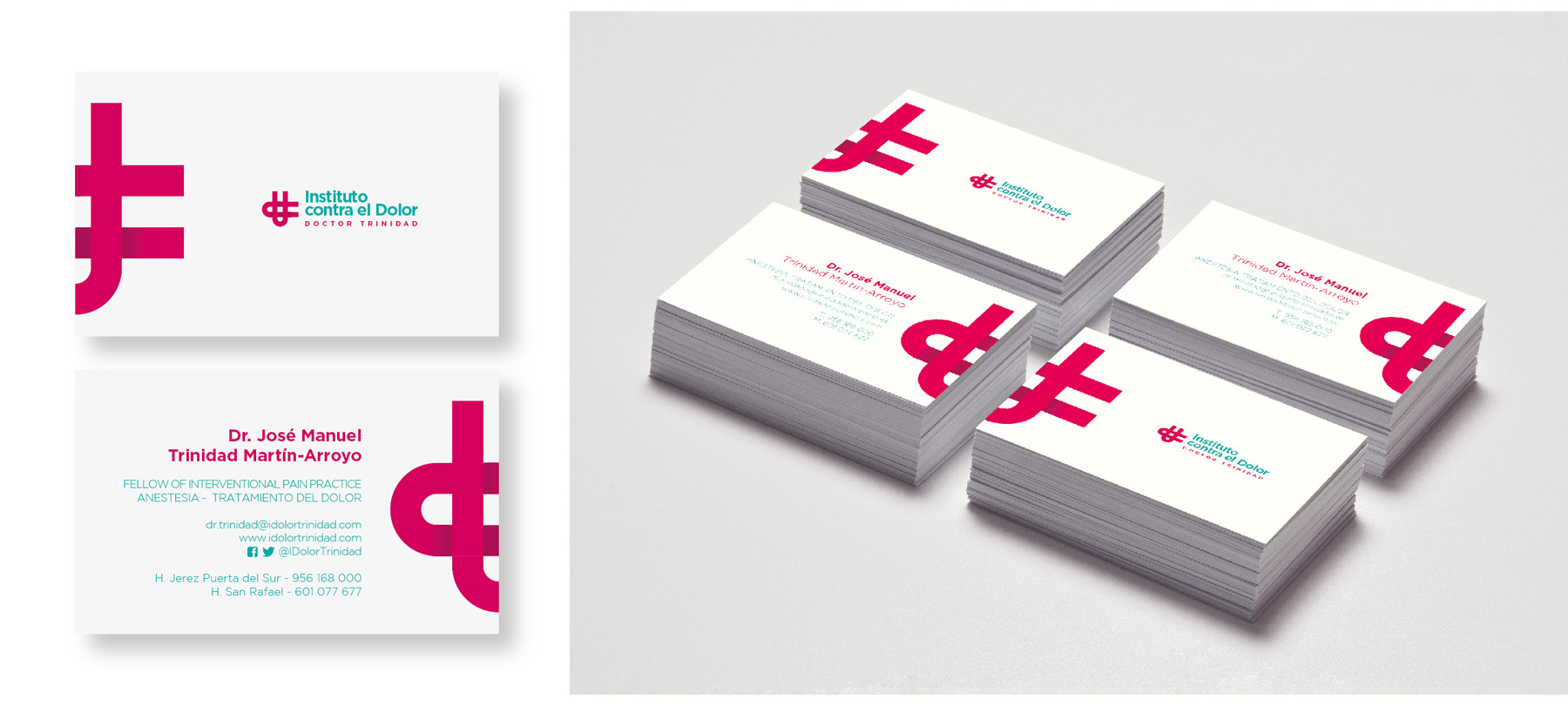
The identity project was an interesting challenge. The client wanted a modern image, moving away from the traditional logos that have long been associated with the medical sector. We developed a colourful graphic design featuring a ‘d’ for Doctor and a ‘t’ for Trinidad. In addition to this, the overall design features a cross as the primary healthcare symbol. The colour scheme consists of dark magenta and aqua green for the typography.
We are very pleased with the result, and above all, the client is very pleased – which is what matters most.
Cliente: Dr Trinidad’s Institute for Pain Management
Servicio: Branding, Identity
Año: April 2017