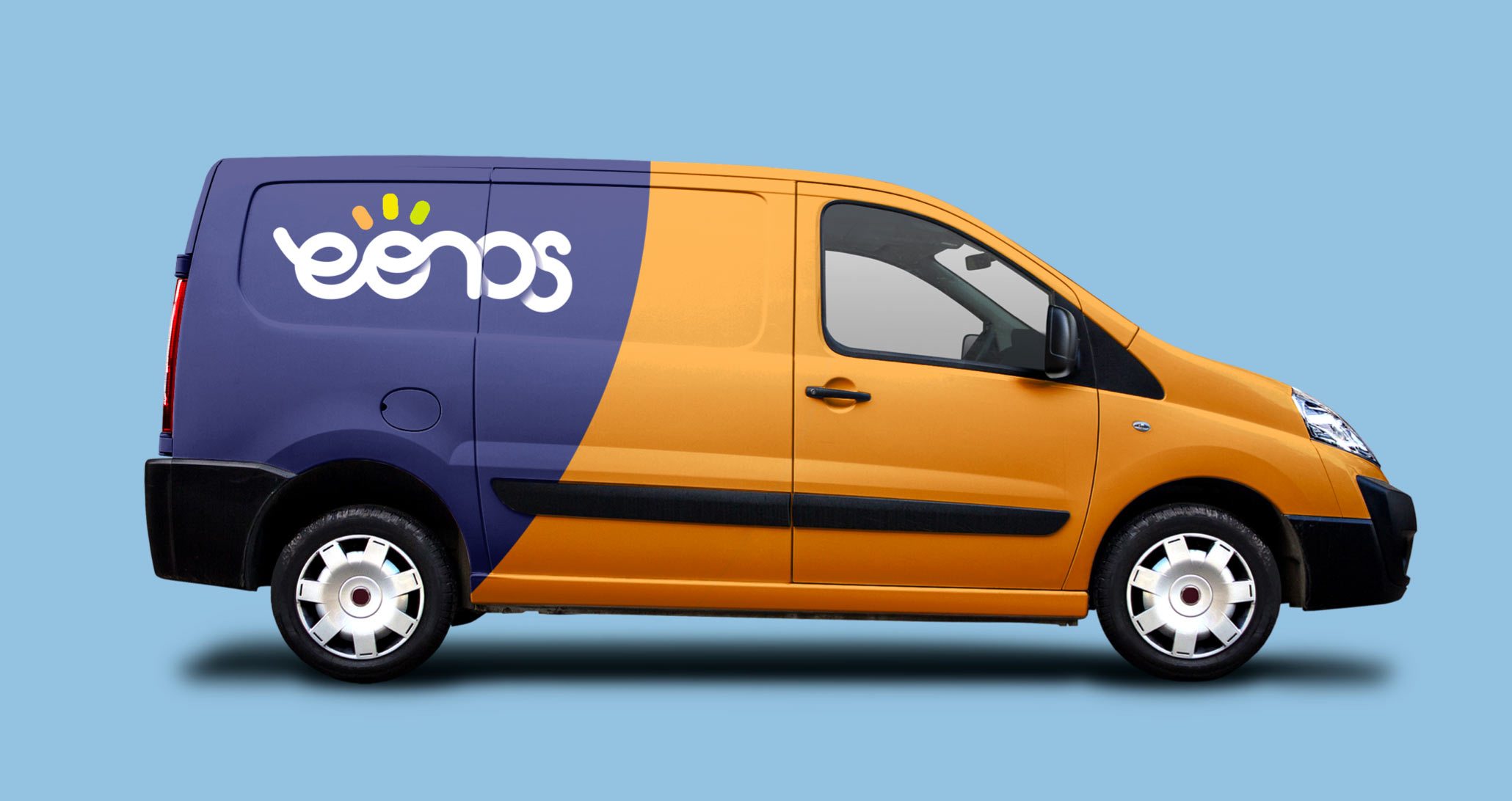
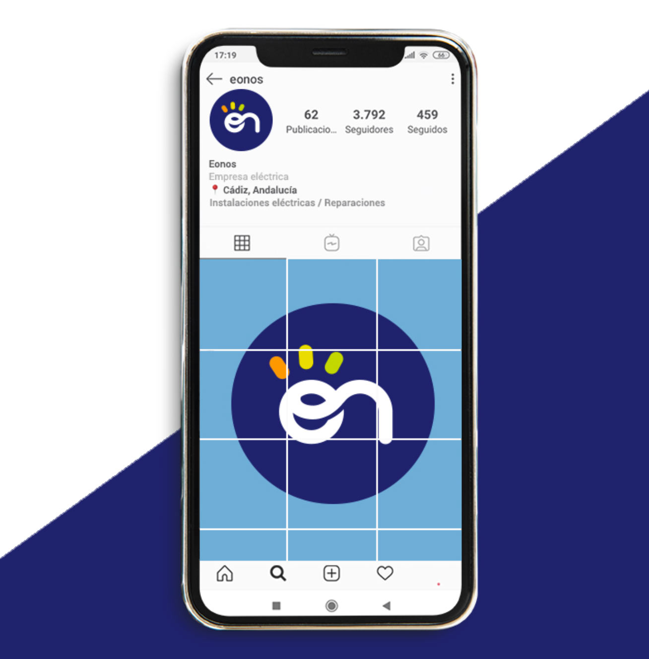
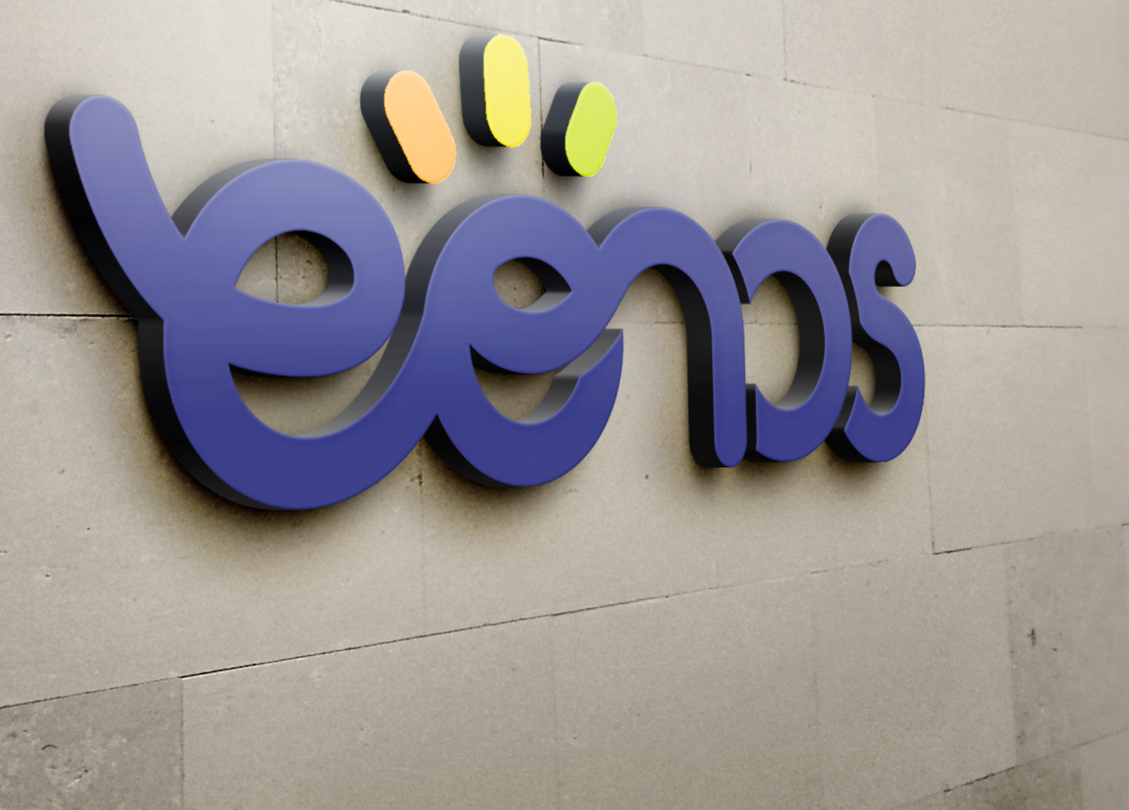
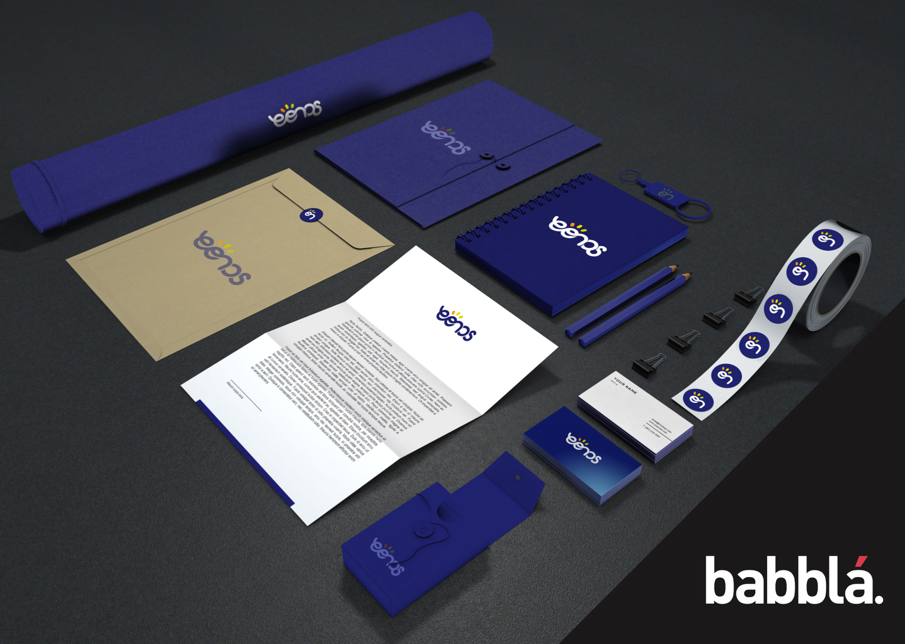
EONOS Identity
Our friends at EONOS, a company made up of engineers that provides technical services to various businesses in the construction and events sectors, asked us to develop a new brand for them.
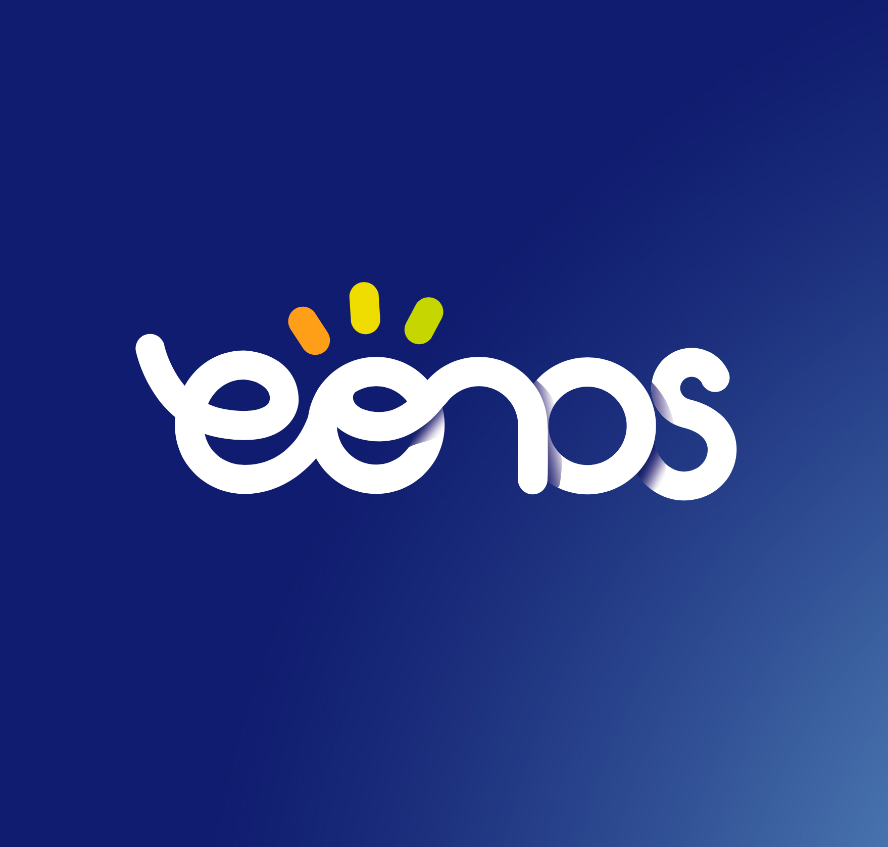
The Eonos logo consists of a typeface created especially for them from scratch. The continuous line and connected letters convey a sense of connectivity, as the company also operates in the electricity sector, whilst acting as a continuous link between the customer and its technical services. The thick, rounded lines convey a sense of security and stability, avoiding sharp edges or corners.
The central part of the logo embodies a balance of weight and strength, highlighting the separable ‘On’ element, which, together with the flash of light, gives the impression that it is switched on.
As for the colours, the orange representing solar and electrical energy is complemented by navy blue and a lighter shade of blue, which neutralises the contrast between such contrasting colours.
Cliente: EONOS
Servicio: identity, design
Año: 2020